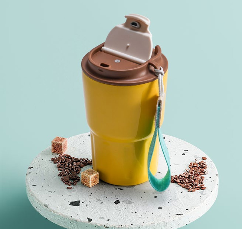
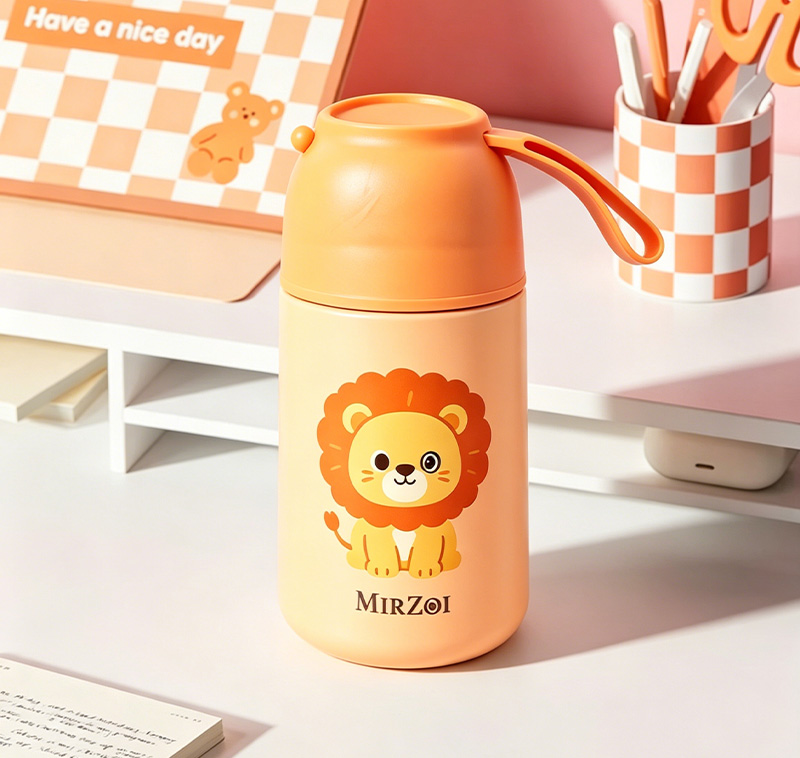
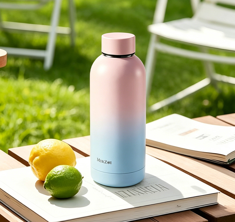
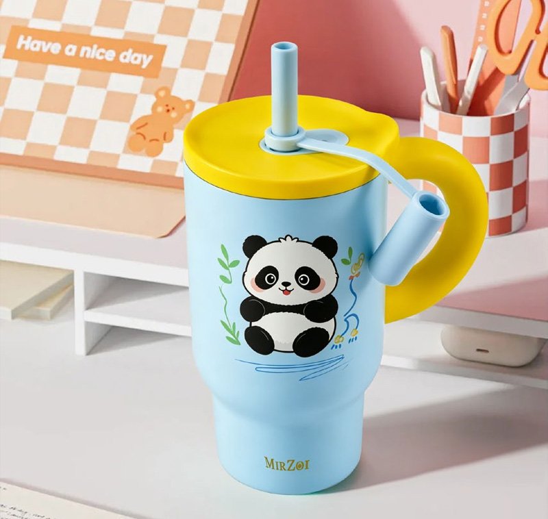
The same logo can look balanced on a flat artwork file and awkward on a finished mug. A handle interrupts the visible surface, a tapered base changes the available space, and a colour gradient can alter the contrast behind the design. Travel mug logo placement is therefore a three-dimensional design decision, even when the artwork itself is simple.
For importers and promotional drinkware buyers, the most useful approval is not just a logo centred on a rectangle. It is an agreed position on the actual mug, with the handle, body shape and chosen decoration process visible. That reference helps the factory reproduce the intended presentation without guessing what front means.
The handle gives the artwork a viewing direction
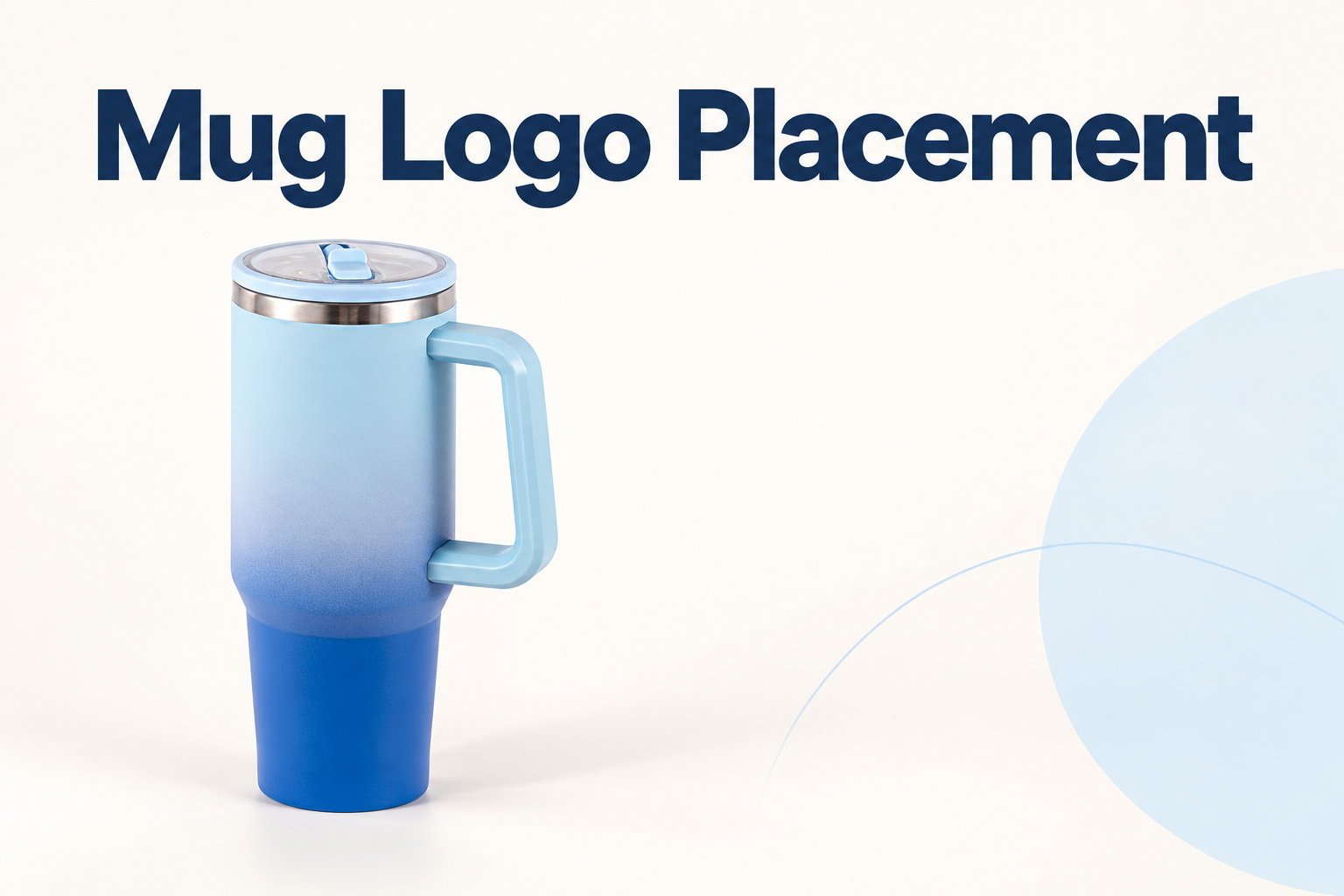
Consider a gradient sliding-lid car mug with a handle on one side. A photograph showing the handle to the right presents a different visible face from one showing it to the left. Neither view is automatically the correct branding direction; the buyer needs to define the intended presentation.
Create a simple orientation reference. Show the lid from above and the mug from the proposed display side, and mark the handle position. Keep this orientation with the artwork rather than relying on phrases such as opposite the handle, which may leave the vertical position unresolved.
If the project needs decoration on both faces, identify them separately. Check how the design appears when the handle changes sides in a user's hand. Two-sided decoration should be an explicit manufacturing request, not an assumption drawn from a mockup showing only one face.
A useful mug print area follows the real surface
Ask the supplier for the available mug print area for the chosen model and decoration method. Keep clear of areas the supplier excludes, which may include handle attachments, sharp transitions or other features. Do not turn the entire visible body into an assumed printable rectangle.
The location of a design matters as much as its dimensions. A low position may approach the taper; a high position may sit close to the rim or lid. Ask how the artwork reference is measured on the actual part so that later samples can be compared consistently.
A wraparound graphic needs additional attention at its start and finish. Decide where the join or blank gap should sit relative to the handle. The supplier should review what is achievable with the actual process before a retail illustration suggests continuous decoration around every surface.
Colour belongs in the artwork review
A dark mark over a pale area may look different when the same mark extends onto the dark end of a gradient. Review the whole design against the selected finish rather than choosing a logo colour from a neutral background alone.
Screen renderings are helpful for layout but are affected by displays and lighting. Where appearance is important, approve a decorated sample in the actual finish. Compare it under an agreed viewing condition and keep photographs as a record, while retaining the physical reference where practical.
Do not assume a process creates the same result on every colour or surface treatment. Ask the supplier to explain the available decoration options for that finish. Claims about wash resistance, adhesion or durability need their own supported acceptance basis; an attractive sample photograph does not establish them.
Turn handled mug artwork into a production reference
| Design decision |
Record on the approval |
Why it helps |
| Display face |
Handle position and labelled front view |
Makes orientation unambiguous |
| Artwork size |
Approved dimensions and file revision |
Prevents unnoticed scaling |
| Vertical position |
Reference to agreed product features |
Allows repeatable placement checks |
| Surface coverage |
Approved area and excluded features |
Respects the selected process |
| Appearance |
Finish and decoration colour reference |
Connects artwork to the real mug |
| Second face |
Separate position, or explicitly none |
Clarifies the complete scope |
This record should travel with the order. An artwork file without its orientation view can be interpreted differently by purchasing, design and production teams. Keep the decoration instructions linked to the correct model and finish code.
Review what the customer will actually see
The first view may be a retail shelf, an online thumbnail or a gift box opening. Consider which face is visible in that setting. A carefully placed logo can be hidden by the handle if photography and packaging present the mug from a different direction.
Review product photographs after the decorated sample is approved. They should show the supplied design, with no digitally enlarged logo or altered body proportions. If several finishes share a listing, confirm whether each illustration accurately represents its own decoration.
Packaging can use the same orientation reference. Where a window or insert presents one side of the mug, agree how the unit is positioned. Treat that as a packing request requiring confirmation, rather than assuming the logo will face outward in every package.
Close the sample review with specific observations
Describe a placement discrepancy using the approved reference: model, artwork revision, measured position and clear photograph. A comment such as the logo looks wrong gives the supplier little basis for identifying the cause.
If the sample needs a change, update the drawing and file together. Avoid approving a new position in a message while leaving the old artwork annotation in circulation. The final sample and the written instruction should express the same decision.
- Confirm the exact mug, finish and decoration process.
- Label the handle position in the intended front view.
- Agree artwork size, printable area and vertical position.
- Review contrast on a decorated physical sample.
- Match packaging and photography to the approved face.
- Retain the final file and sample revision for repeat orders.
Good branding begins with a clear relationship between the design and the object carrying it. Send the artwork with a labelled mug view and intended presentation so that sample approval can address placement, appearance and production scope together.

 English
 Español